Why Your Website Makes Lousy Touchscreen Content

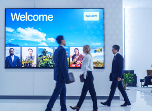
I cannot forget the time I came across a portrait oriented, 72” touch display in the middle of a store. This brightly illuminated kiosk had no audience to entertain. It sat there lonely and expensive. On screen - the company’s e-commerce website. This is a very bad idea.
We could get into a formal discussion about human-machine interaction and how communication on the web and communication via touch interaction are quite different. But it’s not necessary to go so deep. There are plenty, more obvious reasons to avoid using traditional website content for your touchscreen kiosk or digital signage design. Keep the kiosk mentioned above in mind as we walk through seven reasons why traditional websites make for lousy touch screen content.
1. They’re not finger-friendly
In web browser format, you can visualize your navigation with the mouse icon. On a touch screen, you just have to aim your arrow-finger and hope you hit the target. It’s probably why the screen at this store (which I will not name) was so big--to make the links as big as possible. Think about trying to tap the correct link in a crowded shopping cart. Good luck! The ultimate goal of interactive, self-service kiosks is to empower customers and to simplify the user’s process - neither of which is accomplished in this case. It’s annoying. Any user who attempts to navigate the self-service application can be expected to abandon the process altogether. So much for user-centric design for this retailer. Maybe you were worried about cart abandonment, but what do you expect from this type of self-service experience? Be careful, you may be alone on a deserted island at this rate.

2. They’re not eye-friendly
Although I’ve already celebrated the tenth anniversary of 40, my eyes aren’t too bad. I can see decently well. But I still find myself using a browser’s zoom option to increase the font size of certain websites. Good luck doing that on a kiosk. The option is likely hidden because the store doesn’t want jokers setting hilariously large or small font sizes and the website may not adapt well to different font sizes. Wearing coke-bottle glasses? Good luck reading the fine print!
3. They require a constant internet connection

If you’re in retail, you know this - network connections in shopping malls are typically junk. And in general, public-facing environments can have quite poor network connectivity. They’re spotty and guests can expect 404 loading errors peppered across even the most effective websites. Forget about the wasted investment on kiosk hardware. Your website's downtime will catch more attention from consumers than an up-and-running version would - negative attention that is! If it’s running at turtle speed or can’t run at all, do you think your audience is going to blame the network or chalk it up as an overall bad experience with your brand? Worth the risk?
4. They’re impersonal
Since there is just no way a modestly intelligent visitor is going to log into his/her account - exposing their private interests to everyone walking by the screen - websites will have to generically cater to all comers equally. As a result, the level of personalization can be quite poor to nonexistent. Personalized content is engaging and makes conversion way more likely. Without it you won’t be able to run targeted promotions or collect demographic-related information. Utilizing user feedback gathered from surveys and analytics can significantly enhance personalization and improve user experience. Don’t forget that, according to a report by Accenture, 75% of consumers say they are more likely to buy if a brand recognizes them by name, knows their purchase history or makes suggestions based on their purchase history. It’s kind of a big deal! Not just to you, but to your customers who expect personalized content.
Want to Learn how to design an interactive experience ?

5. UI options are limited
If we’re talking about traditional websites and not HTML5 masterpieces coded by a group of talented developers, the range of UI options is quite limited. You run the risk of looking dated and - more importantly - you squander the beauty of having a touch screen at your disposal. Tapping links, filling out forms - yawn!
According to a Clutch UX Survey, when it comes to websites, 90% of respondents said ease of use was considered when they decided whether to keep using the site. Beauty or attractiveness was a determining factor for 66% of respondents. Applying these considerations to a public kiosk, we can image that more users would abandon the experience as their peers are looking on at their frustration and failure to navigate the app. Designing interactive elements optimized for touchscreens, such as ensuring their visibility and ease of interaction, is crucial.
6. They cannot interact with their environment
It’s said that websites live in a sandbox. They cannot communicate with the local environment and the local environment cannot communicate with them. This is sensibly done for security purposes but, ok, you’re cut off from a wealth of technology options that would enhance the range of experiences possible. Sensors, voice recognition, Internet of Things. Don’t know what those are? Don’t worry because with a website, you can’t use them! Just know that you are not engaging your customers, which, again, is the number one goal of deploying interactive kiosks.

7. They’re uninspiring
Why would you display onsite what a person could do on their phone or computer? Shouldn’t you give them something unique that takes advantage of an onsite visit, creating experiences that couldn’t be reproduced on a website? Like, for example, multi-touch. Multi-touch! It’s awesome! Wouldn’t that be cool? Be honest, is your website so fantastic that visitors will go out of the way to use it on a big screen? Say no to boring.
--------------------------------------------
If you have a staff of developers with HTML5 skills, there are ways to make Web-hosted experiences more modern and engaging. But that approach takes a lot of dedicated time, resources, and effort - and even then, you risk the above challenges. As a result, many opt for the easy way out and use a traditional website. Hopefully, you now understand that’s a shortcut you should not take.
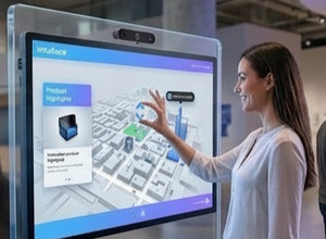
Here’s a thought. Use Intuiface on those screens! Coincidentally, Intuiface-based content doesn’t suffer from any of the above limitations. ;-)
Want to learn more about Intuiface? You can try it yourself - for free! Start our 28-day trial, giving you access to 100% of Intuiface's capabilities.