Design Lessons Learned When Reusing a Mobile Sales Pitch in a Trade Show Kiosk
In this article I review lessons learned about how to turn a small-sized sales pitch for a mobile sales force into content suitable for a large-sized kiosk. Have a PowerPoint lying around? Some sales collateral you'd like to repurpose for a show? This article is for you.
Introduction
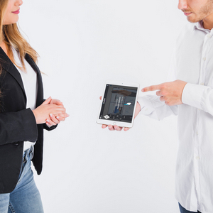
In the Intuiface Examples is a sales pitch about our software. Formatted for tablet displays, this interactive experience is a comprehensive tour of all things us and is intended for download by those in the evaluation phase. The beauty for our business is this experience both tells our story in an interesting way while, at the same time, shows off all that our software is capable of.
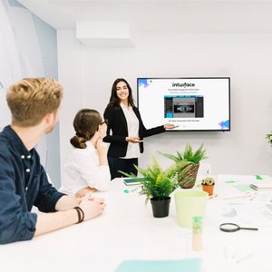
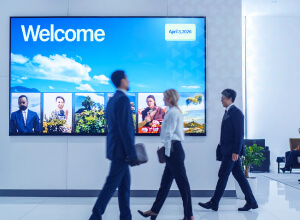
It didn't take rocket science to wonder if we could repurpose this sales pitch for a large screen kiosk in our tradeshow booth. The idea would be to mount a large multi-touch display - this 86" behemoth - on a very visible wall. By doing so, we'd catch attention at even a great distance while, at the same time, deeply engaging users at the display.
So we did it. And by doing it, we learned about a few things about how to successfully upsize a sales pitch.
In this article I review lessons learned about how to turn a small-sized sales pitch for a mobile sales force into large-sized kiosk. Have a PowerPoint lying around? Some sales collateral you'd like to repurpose for a show? This article is for you.
Impact of Device Size
The most significant factor to accommodate is screen size. Unless you've got a bunch of weight lifters for a sales staff, their devices will range from tablets to - at best - laptop PCs.This means we're talking about 9" to 17" displays. That's a far cry from the 48"+ screens you'd be using at a trade show.
Consider the implications of change in screen size. With small screens:
- Small amount of screen real estate and thus limits on the amount of content that can be displayed legibly
- Small group sizes with one presenter and a low number of people huddled around the device
- Maneuverable as it can be hand-held
Meanwhile, with large screens:
- Significant amount of screen real estate and thus more freedom to include large amounts of content without impacting legibility
- Ability to accommodate a large number of people, with one presenter and very large audiences
- Fixed, mounted to a wall, table, or freestanding kiosk
Can the exact same sales pitch work on both small and large format displays without any design changes? For the reasons mentioned above - no! There are two fundamental areas where design needs to change: navigation and content density. Let's start with navigation....
Effects on Navigation
Our tablet-based sales pitch had a permanently visible menu for primary navigation, always reachable in the top-left corner:
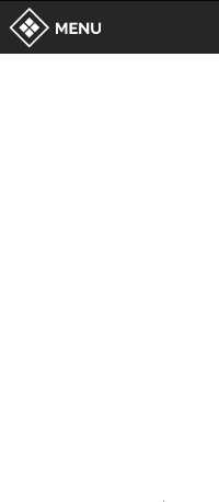
It’s simple and handy, but that’s not something you want on an 86 inch screen. Why? Two reasons. First, maybe not everyone is tall enough to reach! Second, what if you find yourself on one side of the screen? Unless you're a very long-armed sort of person, it's impractical to stretch across the display while blocking the remaining audience's access to content.
We needed a navigation menu reachable from anywhere, regardless of the side on which the sales rep was standing or how tall they were.
We decided to go with a menu that could pop up anywhere on the screen with a handy trigger. We chose a double tap as trigger because it doesn't interfere with all the other usual gestures (swipes and simple taps) one would use with visual content. There is also a “knock knock”connotation, implying that one is asking permission to open a door (or, in this case, a menu).

Anticipating Uses
If your experience must accommodate self-service, you have a responsibility to guide your user, to hold their hand and ensure they don't get lost. That means everything about navigation must be clearly understandable and implies that, among other things, all icons must have text labels.
The original version of the experience for our large format display had a very explicit navigation menu with text labels, almost sentences really, providing details about the purpose of each destination.
The thing is, we knew that Intuiface reps in our booth would prefer to guide users through company presentation, using on-screen content as a way to guide the conversation or answer questions. Sure,the experience could be used for self-service, but at a trade show our goal is to go human-human, not human-machine. As a result, we decided to get rid of text labels in the navigation menu and just prepare our reps in advance. This would vastly clean up the look without sacrificing usability.
Another feature we added, tailored for the same trained presenters, were large invisible zones on the top and bottom of each scene which - when tapped - would initiate a vertical scroll of the content one page at a time. No need to perform large fancy swipes all over the screen when a simple tap could do the trick! (However, we left in the ability to vertically swipe to satisfy the curiosity of booth visitors too eager to keep their hands off the hardware.)
Accommodating the Space
As noted previously, the anticipated location of the display and where the audience would be positioned had a great influence on how we thought about navigation.
We figured:
- Minimally: One presenter standing to one side of the screen and audience members standing in front of the rest of the display
- Maximally: Two presenters on either side of the display (typically a Sales Rep and a Technical Rep ) and then a group of folks in the middle.
The implication was we had to give even greater attention to how navigation options could be accessed and manipulated. The side of the screen most accessible to a presenter could not be anticipated, and forcing the presenter to run back and forth in front of the screen couldn't be permitted. Rather, the ballet should be enabling the presenter to do anything from anywhere AND enabling the audience to participate as well without having to dance in and out of position.
Here's what we added:
- Globally, we made the navigation menu “throwable” by tweaking its inertia so it could be pushed from one side of the screen to the other. We added to this a neat effect that flipped buttons to the side of the navigation icon closest to the middle of the display.
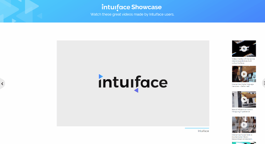
- On the “Showcase” scene displaying all our videos, the menu used to select an industry filter was configured so that it could be made to disappear on one side of the screen, appearing on the other side. This was accomplished by adding a handle which, when tapped, meant "Move the filter menu to this side of the screen, please".
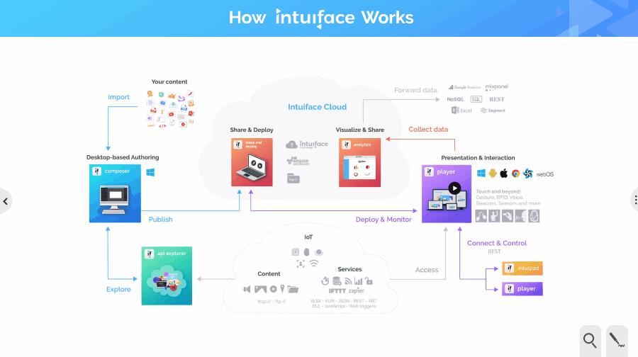
- On the “How It Works” scene displaying three different diagrams, to improve usability of the drawing tools, we added a handle replicating what we implemented on the "Showcase" page. Tapping the handle caused the drawing tools to jump to the handle's side of the screen. We applied the same treatment to the Pricing Page button on the related “ROI and Pricing” scene.
Effects on Content Density
As we built the large display version of our experience, our initial thought was to take advantage of the significant amount of screen real estate. That is, cram a lot of information into each scene. Testing made us realize this thought as all wrong. In fact, we'd be better off limiting the amount of content! In fact, keeping it simpler than the original tablet-based presentation worked better. Bigger screen but less content per scene? Why was this?
In a nutshell, it was to avoid information overload.
The tablet based experience was intended to be downloaded by someone willing to learn about us and our product. They'd have the time and interest to dig in. At a trade show, time is a luxury. Content had to be simple and easily digested
The right decision was to step lightly. Several scenes were trimmed down to core information.
For instance, we reworked our “Home” scene quite a bit to create something clean and readable from a medium distance (for people passing by or near the booth). This included removing our large feature list (almost 60 entries!) and picked just four features we wanted to highlight.
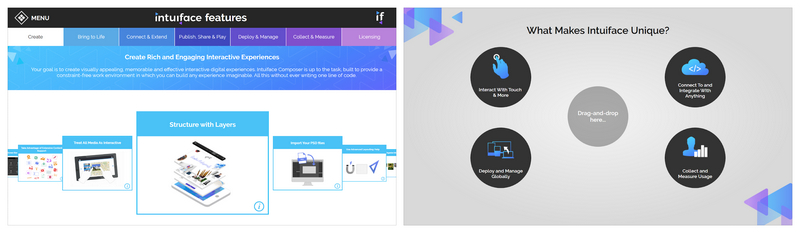
We also updated the approach to presenting these four features by implementing a drag’n drop scenario. By centering the drop zone, we made it reachable from either side of the screen. As a bonus - in the case of a single presenter - that presenter could slide a couple of features to the center and then encourage a member of the audience to initiate the drop-and-drop for themselves from the other side.
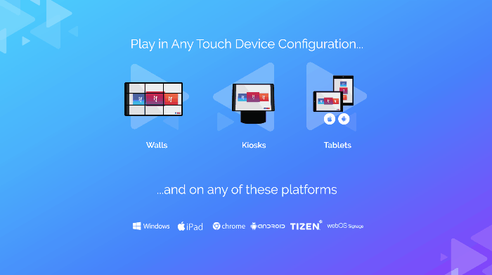
The same approach was used in the Device section of our “Home” scene. We knew that on such a large screen, touch interaction should be available everywhere. Each iconic representation of a device - wall, kiosk, tablet - when tapped, opened a dedicated media scene whose images and videos could be manipulated by the user. These layouts encouraged manipulation and engaged the audience nicely while subtly reinforcing the notion that Intuiface supported multiple touch points.
Side note: Have you ever sat in the front row at a movie theater? Remember how you couldn't see the entire screen at a glance, how you needed to turn your head side-to-side? Stand in front of an 86" display and you get the same feeling. Yet another reason to consider content simplicity: you don't want to tire the necks of your audience!
Conclusion
We first exhibited the large screen version of this experience at ISE 2019 in Amsterdam and it was a big hit. As hoped, it attracted attention from a distance, gave the booth a high tech feel, encouraged self-service interaction when our booth reps were busy, and made for engaging conversations. If you're coming to DSE 2019 in Las Vegas this March then you'll get to see it, and put your hands on it, because we'll be there in Booth 3240.
I hope you found this design insight helpful. Every experience is different, of course, but commonalities abound. For sure, you need to consider the navigation and content density aspects as screen sizes change. Even the smallest alterations can make a big difference!

