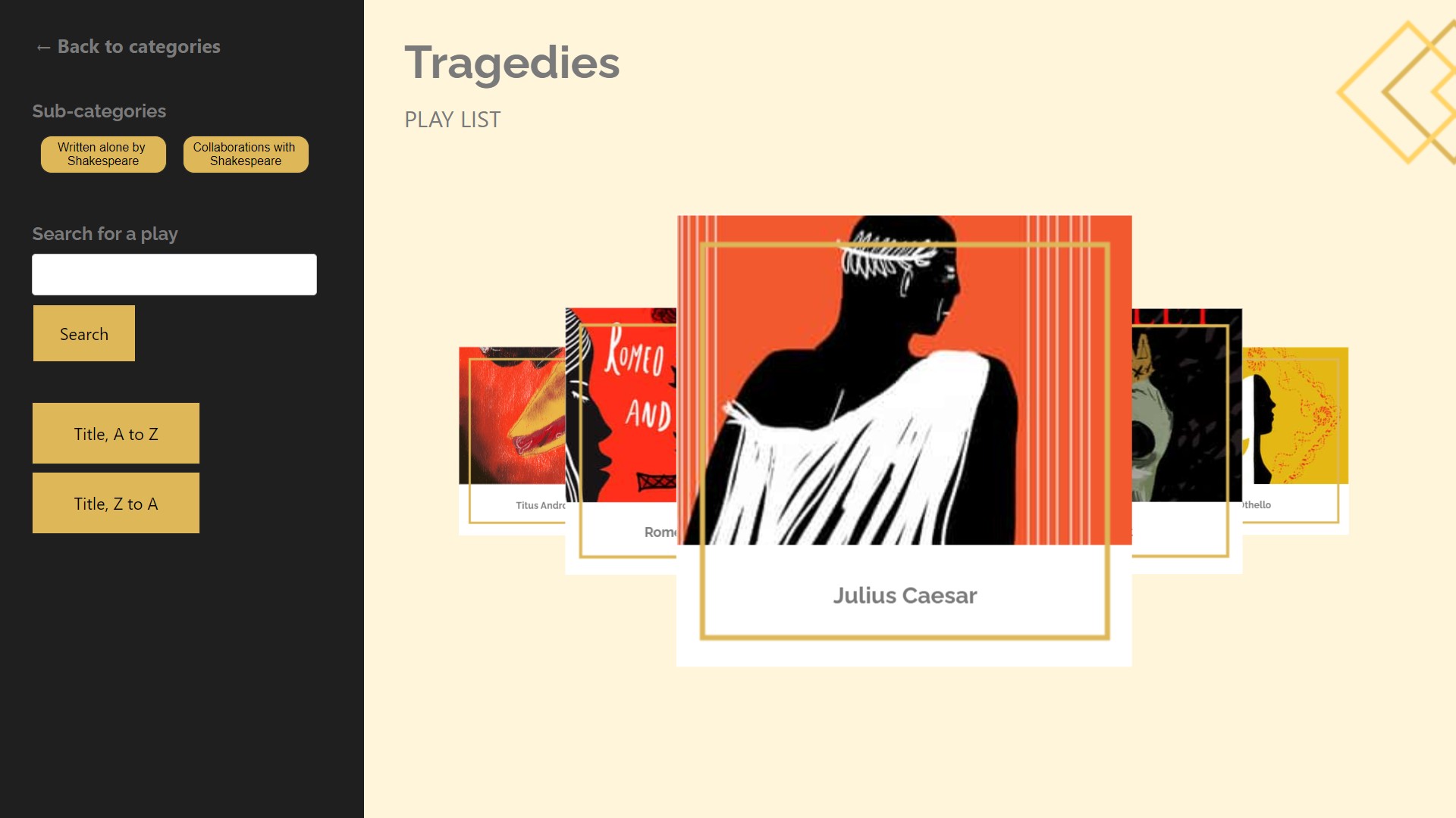
The user is a visitor to a store, trade show booth, museum exhibit. They are interested in learning more about a particular topic, such as items for sale, services for hire, or information about a subject of interest. An attract screen encourages the visitor to engage. A tap of the display leads to a screen with two options: 1) browse the catalog, and 2) search the catalog. The bottom of the screen permits the visitor to choose between English and French. Tapping the Browse option opens a list of all first-order categories. Tapping a category opens a list of second-order categories. A tap of of a second-order category opens a list of qualifying items. Any item can be tapped to reveal details. Back on the main screen, the visitor could alternatively type in a search term. All qualifying items are displayed in a list, and any item can be tapped to reveal details.
The goal of these experiences is to illustrate the Catalog Reference Design best practices in action for presenting a catalog of items and enabling a target audience to browse that catalog.
We present both a Retail and an Exhibit example to illustrate how the fundamentals of "Catalog" can be adapted for any environment.
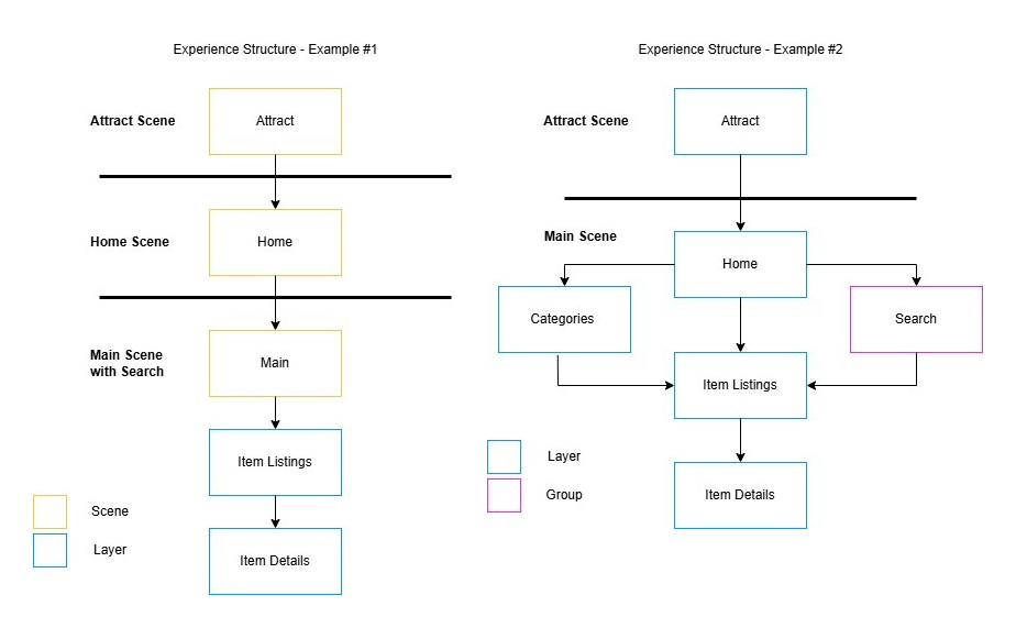
We also present two different design approaches. In one, the main scene is used for catalog listings, catalog search, item listings, and detail display. In the other, we've separated the main scene from a home scene in which the catalog listing appears. The former is a more elegant approach to experience design, as long as you're comfortable working with multiple scene layers.
Users are encouraged to experiment with variations. Different collection types, additional languages, more or fewer category levels.


