How to Make Your Corporate Innovation Center More Interactive & Engaging

Most corporate innovation centers share the same quiet problem: the screens are beautiful, and no one engages with them. Visitors walk through, read a few panels, watch a looping video, and leave without anything making an impression. The center looks impressive on a facilities tour, but it doesn't move people. It doesn't make them think, compare, or decide.
That's the gap this guide addresses. Not how to make your center look more interesting, but how to make visitors do something while they're there.
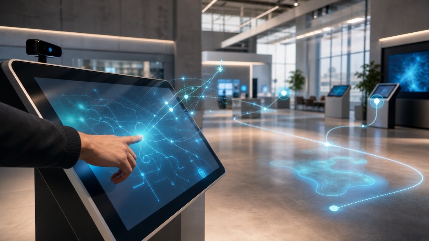
What visitors should actually DO in your innovation center
The question most design teams skip is the most important one: what behavior do you want to encourage? Three outcomes are worth designing for explicitly:
- Participation (a visitor takes an action, not just reads)
- Exploration (a visitor discovers something they didn't know to ask for)
- Completion (a visitor finishes a task: learns a concept, compares two options, reaches a decision)
Each of these outcomes maps to a measurable KPI. The four that matter most for innovation center engagement are interaction rate (what percentage of visitors touch or trigger something), dwell time (how long someone stays at a station), drop-off points (where people abandon a flow before finishing), and task completion rate (how often someone reaches the intended endpoint).
SeenLabs reports that museums using digital exhibits see 55% longer visitor engagement compared to static displays. That number doesn't automatically transfer to every corporate context, but it tells you directly what's possible when you shift from broadcast to participation.
Map your visitor journey before you place a single screen
A visitor journey map for interactive exhibits forces you to think zone by zone. A practical five-zone model looks like this:
- Entrance/lobby: This is orientation. An interactive welcome that lets visitors self-select their role(executive, partner, press, employee) sets a personalized path for everything that follows.
- Gallery entrances: Brief, curiosity-triggering prompts. Not a full story, just enough to make someone want to walk in. A single touchscreen question or a physical trigger works better than a paragraph of text.
- Within exhibits: This is where depth lives. Deep-dive stations, timelines, before/after comparisons, and product-path selectors all belong here.
- Rest areas: Low-pressure discovery. A browsable catalog or a short "take a quiz" moment that doesn't demand attention.
- Exit/hand-off: QR codes, email capture, or a printed summary that extends the conversation beyond the room.
Discovery beats information dumping in every one of these zones. When a visitor can choose their own path through your content, they stay longer and remember more. The research on interactive museum displays reinforces this: guided choice creates investment in the outcome.
Interaction design patterns that make people lean in
Five patterns consistently drive engagement at touchscreen kiosk stations:
Choice-driven storytelling. Let visitors pick an industry, persona, or use case before the story begins. The content doesn't have to be different, but the framing does. A healthcare executive and a logistics manager will engage with the same innovation if you lead with their world's unique context.
Guided deep dives. Zoomable layers, timelines, before/after sliders, and short curator video clips give visitors a reason to spend five minutes at a station instead of 30 seconds.
Object-triggered moments. When a visitor places a physical object on a surface or picks up an RFID-tagged product, a digital layer responds. This "lift and learn" approach works particularly well in innovation labs where physical products are already on display.
Wayfinding as experience. An interactive wayfinding map does more than tell visitors where to go. It can surface "next recommended stop" suggestions based on what someone has already seen, making the center feel personalized rather than generic.
Feedback loops. A one-question micro-survey embedded at the end of an interaction, or a QR hand-off to a mobile form, captures sentiment without stopping the flow. The data feeds your iteration cycle.
Analytics that answer "what's actually working?"
The most underused asset in any innovation center is behavioral data. Dwell time tells you which stations hold attention. Touch-path analytics show exactly where visitors drop off in a multi-step interaction. Task completion metrics tell you whether people are actually finishing what you designed them to experience.
The dashboard-by-question approach is more useful than generic reports. Instead of "show me all interactions," ask specific questions: Why are 70% of visitors not reaching Station 4? Which content paths have the highest completion rates? What's the average session length at the prototype demo zone versus the timeline exhibit?
Intuiface's Analytics, for example, is built for this kind of interaction behavior tracking. You can build dashboards around specific questions, share them with stakeholders as read-only links, and use the data to retire under used content, revise prompts, or A/B test different interaction entry points. The dwell time charts alone are often enough to surface the two or three stations worth redesigning first.
Accessibility and usability: design so more people can participate
Physical accessibility starts with placement. The ADA Standards for Access and Design state that all interactive touchpoints must be at or below 48 inches. That's a hard constraint for wall-mounted screens in particular. Get this wrong early, and you'll be remounting hardware after launch.
UI accessibility is a separate layer. High-contrast color pairings, minimum 16pt body text, and touch targets of at least 44x44 pixels are baseline requirements. Navigation always needs a visible back button and a home/cancel option. When someone doesn't know where they are or how to exit, they stop interacting.
Beyond touch, think about alternative interaction inputs. Voice commands, gesture recognition, and keyboard navigation aren't just nice-to-haves for visitors with disabilities; they're also practical in high-traffic situations where screen hygiene or congestion makes touch less comfortable. Intuiface's accessibility design features cover speech recognition, keyboard navigation, and screen reader support in the same no-code environment.
Operational blueprint: who updates what, and how fast?
Innovation centers have a content refresh problem that most exhibit designs don't account for. New prototypes arrive. Product priorities shift. A keynote happens, and suddenly three stations need updated messaging by Monday. If your system requires a developer to push every change, it can fall behind, and stale content is worse than no content.
A sustainable governance model has three layers:
- A content owner per zone (usually a product or communications manager) with permission to swap text, images, and videos through a CMS without touching the interaction logic.
- An experience designer who owns the user interfaces and can update flows with a no-code tool.
- A technical owner (usually IT or an integrator) who handles device health, API connections, and platform updates.
Intuiface's Headless CMS is an example of a headless content management system that lets content owners update cloud-hosted assets that flow directly into live experiences. Meanwhile, Intuiface Composer handles the interaction logic separately, so a content update doesn't break the behavior, and a behavior change doesn't require re-importing all the assets. This separation is what makes fast refresh practical at scale.
Rollout works best in phases: pilot one zone completely, measure it, refine the templates, then scale to additional stations with those templates already proven.
Implementation roadmap from concept to production
Phase 1: Discovery and experience mapping. Identify stakeholders, define success metrics, and document what each zone needs to accomplish. Don't skip this; misaligned expectations about what the center should "do" are the most common cause of expensive redesigns.
Phase 2: Interaction prototyping. Wireframes first, then interactive mockups. Intuiface's Composer lets you build clickable prototypes in the same environment you'll use for production, which significantly reduces hand-off friction between design and build.
Phase 3: Integration and deployment. Connect APIs for live data feeds, configure sensors or RFID readers if applicable, migrate content assets, and set up device management. Intuiface's API Explorer builds real-time Web API integrations without code, which matters when you're pulling in product data, CRM fields, or real-time metrics.
Phase 4: Testing. Run an accessibility audit against the ADA standards, and usability sessions with real visitors if possible. Verify idle/attract loops so screens never show a blank or frozen state. Test failure modes: what happens when an API is down? What does the screen show?
Phase 5: Launch and iterate. Set a weekly analytics review for the first 90 days. Expect to revise two or three interactions based on real drop-off data before the experience is fully tuned.
Teams using a no-code platform like Intuiface typically cut development time by around 80% and project costs by up to 60% compared to fully custom builds, and the ongoing savings on content updates are usually larger than the initial savings.
Reusable checklist for your next build
Content: Are interaction prompts specific enough to invite action? Is the visual hierarchy scannable in under three seconds? Is there a refresh calendar with named owners?
Tech: Does the system behave gracefully when offline?Are attract/idle loops configured? Are all data integrations tested against failure states?
Ops: Is there a named owner for each content zone?Are assets tagged with a consistent naming taxonomy? Is there an SLA for device support?
Measurement: Which KPIs are reviewed weekly (drop-off rates, interaction completion) versus monthly (dwell time trends, content retirement decisions)?
FAQ: costs, timelines, and maintainability
How long does a typical build take? Complexity drives timeline more than screen count. A single-zone pilot with three to five interaction types can go from brief to production in four to eight weeks with a no-code platform. A full center with API integrations, sensor triggers, and multilingual content will typically take three to six months. Using no-code software like Intuiface can reduce that time by another 50% or more.
Will it break when we update content? It can, if the architecture mixes content and logic in the same layer. Template-driven experiences separate them. With Intuiface, content editors update assets through the Headless CMS while interaction logic stays intact in the experience built using Composer. A text swap doesn't touch a trigger; a layout change doesn't wipe a data feed.
What about privacy if we use computer vision? Computer vision audience analytics typically operate on anonymized aggregate data (group size, age range, attention time) without storing individual images. Confirm this with your vendor and document it for visitors. Privacy by design is an expectation, not a differentiator.
What's the realistic cost range? Entry-level single-zone deployments with off-the-shelf hardware and a no-code platform can start under $5k all-in. Multi-zone, multi-integration builds with custom hardware enclosures and dedicated content development will, of course, run (significantly)higher. The better question is total cost of ownership over 36 months, including content updates, because that's where template-driven, no-code interactive experience platforms create the most measurable savings.
The screens in your innovation center can be genuinely useful tools for shifting how visitors think about your organization. That shift doesn't come from better content alone. It comes from designing for participation at every touchpoint, measuring what actually happens, and having a platform that lets your team keep iterating without calling in a developer every time.



.jpg)

